One system, three surfaces.
Ristra is a shared shopping list that keeps households in sync, aisle by aisle. This design system is the single source of truth for how Ristra looks and feels — on the web app and PWA, in the native iOS app, and across the marketing site. Every color, type style, and component below is generated from one token source, so the brand can never drift between platforms.
Tokens flow downhill
Colors, dimensions, type, and motion live in a single source module. A zero-dependency generator expands the nine brand anchors into tonal ramps, verifies every semantic pairing against a WCAG contrast contract, and emits one artifact per platform. Nothing downstream is hand-edited.
Web app & PWA
tokens.css drops into the app's global stylesheet. Semantic names
(--bg, --accent, --title…) are unchanged from the
app's existing vocabulary, so adopting the system is a value swap, not a rewrite.
iOS
Theme.swift is a drop-in replacement for the app's
Color extension — same members, same dynamic(light:dark:)
behavior, new brand values. SF Symbols and system type stay, per the Liquid Glass rules.
Marketing site
getristra.com consumes the same tokens.css, replacing its hand-copied
snapshot. The brand SVGs and both display faces ship from this repo's
assets/.
Figma
ristra.tokens.json is a W3C-DTCG token file. Import it with Tokens
Studio to mirror ramps and semantics as Figma variables with light and dark modes.
Logo & lockups
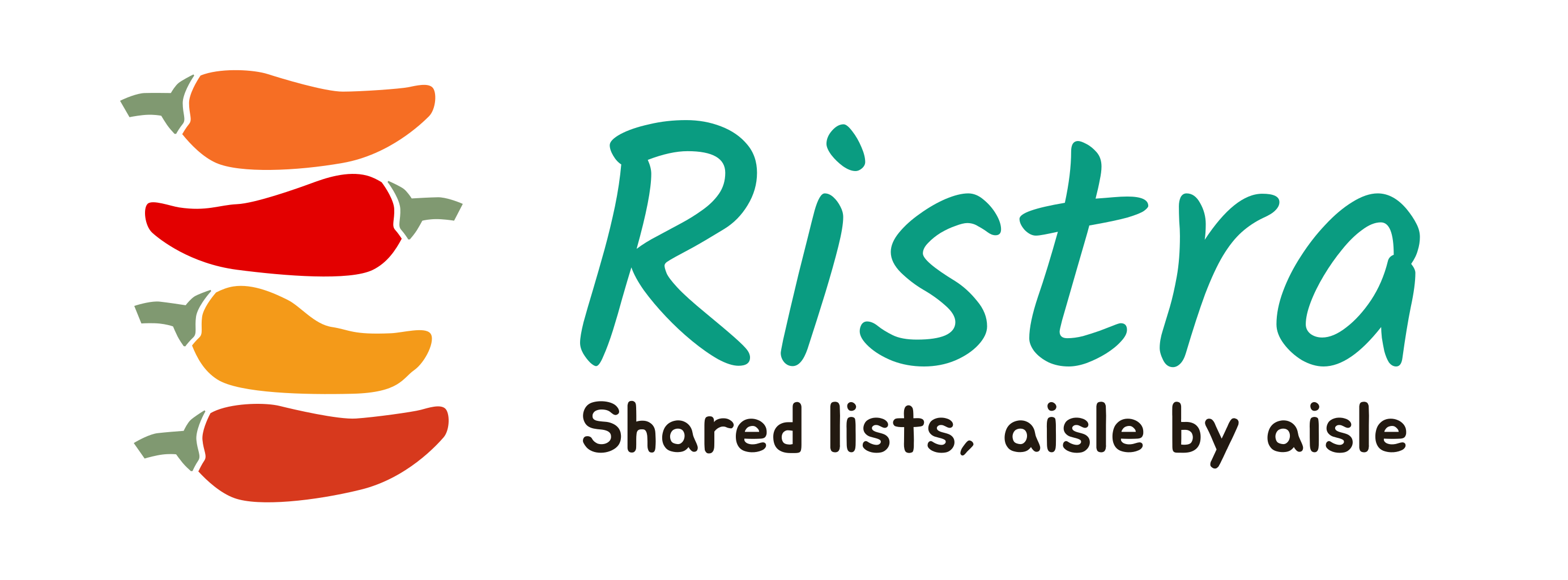
The mark is a ristra — four chilies strung together, one per household member pulling the same list. It hangs on one of two brand fields: sand in light contexts, earth in dark ones. Variant names describe the ink, not the background: use the light-ink files on earth, the dark-ink files on sand.
Full-color lockups
Monochrome lockups
For single-color contexts: embossing, watermarks, partner co-branding, or anywhere the full palette would fight the surrounding design.
Icon tiles & bare mark
ristra.icon) — glass materials over the vivid brand anchors — is
canonical for the iOS app icon only. Every web and marketing icon surface
(favicons, PWA set, touch icons, site marks) rasterizes from the flat tiles
icon-light.svg / icon-dark.svg in this repo. In-app, the
stacked mark itself is the logo; the old v2 line chili survives only as decorative
illustration.
Wordmark & tagline
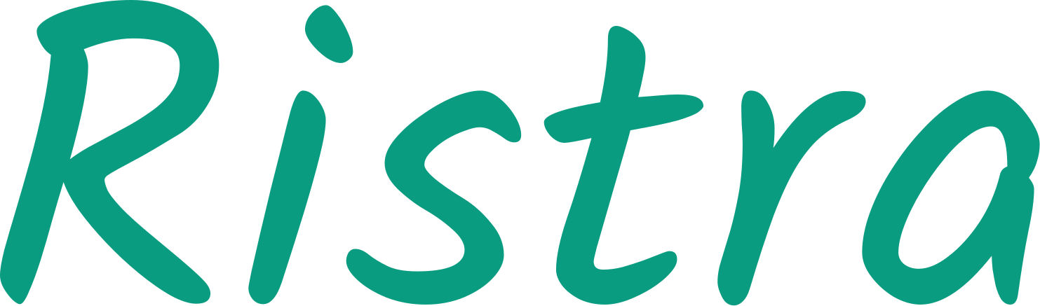
Two display faces, two jobs, and they never trade. Solitreo sets the wordmark — and only the wordmark. Jua sets the tagline and short display moments on marketing surfaces. Neither ever sets body copy; body and UI text are always the native system stack.

Live specimens
| Face | Token | Use for | Never for |
|---|---|---|---|
| Solitreo | --font-display | The wordmark "Ristra" | Anything else — headings, UI, body |
| Jua | --font-tagline | Tagline; short marketing display lines | Body copy, UI labels, in-app text |
| System stack | --font | All body and UI text on every platform | — |
| Mono stack | --font-mono | Code, token names, quantities | Prose |
Clearspace & minimum sizes
Give the ristra room to hang. Keep a clearspace of one chili-height (¼ of the mark's height) on all sides of any lockup, and never let other elements cross it.
| Asset | Minimum size | Notes |
|---|---|---|
| Bare mark | 24 px tall | Below that, use the icon tile instead |
| Full lockup (mark + wordmark + tagline) | 160 px wide | Drop the tagline below 220 px |
| Wordmark alone | 72 px wide | — |
| Icon tiles | 16 px | Favicon floor |
Don'ts
- Don't recolor the chilies outside the four brand body colors.
- Don't set the wordmark in any face but Solitreo, or the tagline in any face but Jua.
- Don't place the dark-ink lockups on earth, or light-ink lockups on sand.
- Don't rotate, outline, shadow, or add effects to any lockup.
- Don't use the app-icon glass palette in UI or marketing surfaces.
Color
Nine brand anchors — the four chili bodies, the stem, the two fields, and the two wordmark turquoises — expand into seven tonal ramps. Anchors are brand and illustration colors; interface color always comes from the semantic tokens, which are locked to contrast-safe ramp steps by a generator-enforced WCAG contract.
Brand anchors
Values are verbatim from the Figma brand file and the SVG assets. Anchors flagged brand only fail AA as text on their field — use their ramp's deeper steps in UI instead. Click any swatch to copy its hex.
Tonal ramps
Twelve steps per ramp, 50→975, built on an OKLCH lightness ladder. The dot marks the step where the brand anchor survives verbatim. The earth ramp doubles as the warm-neutral ladder: sand sits at 100, earth at 950, and every surface, border, and text tone between them is brand-derived. The 975 near-black exists for dark-mode backgrounds — in dark themes, cards sit at earth-950 (the brand field) on an earth-975 page.
Semantic tokens
The interface vocabulary. Names match the web app's existing custom
properties; iOS mirrors them in Theme.swift. Live values below follow the
page theme — flip the toggle up top and watch them re-resolve.
| Token | Light | Dark | Role |
|---|
Contrast, proven live
Each card renders its actual token pair and computes the WCAG ratio in your browser. The generator enforces these same minimums at build time — a failing pair can't ship.
Light theme
Dark theme
Typography
Body and UI text is always the platform's native stack — SF on Apple platforms, Roboto territory on Android later. Zero font payload in product surfaces; the two brand faces appear only where the brand rules allow.
--text-base is the floor for form controls.
Spacing & layout
A twelve-step scale. New work uses the tokens; legacy literal paddings map to the nearest
step during migration. Content columns wrap at 1080px; the app respects device safe areas
via the --safe-* insets.
Radius & elevation
Soft, but not bubbly: 14px on cards, sheets, and containers; 9px on inputs and nested elements; full-round on pills and buttons. Elevation is one gentle earth-tinted shadow — Ristra surfaces are separated by tone and hairline borders more than by depth.
14px
9px
999px
ambient + key
Motion
Quick and settled — checks tick, sheets glide, nothing bounces. Three durations, two curves. Click a chip to play its timing.
Always honor prefers-reduced-motion: replace movement with
opacity, or skip the animation entirely.
Iconography
Two icon systems, split by platform on purpose. The web app bundles Font Awesome from a license-gated kit — Jelly Duo duotone for UI chrome, Pro solid for department glyphs (Jelly Duo has no food icons; the mix is deliberate). iOS uses SF Symbols exclusively, per the Liquid Glass rules. Icons are not bundled on this public page.
| Role | Web (Font Awesome) | Family |
|---|---|---|
| Confirm / check off | faCheck | Jelly Duo (regular), secondary layer at 0.4 opacity, fills currentColor |
| Add / quantity up | faPlus · faMinus | |
| Settings | faGear | |
| Delete / remove | faTrash · faXmark | |
| Share & invite | faShareNodes | |
| Lists / cart | faCartShopping | |
| Stores | faShop | |
| Edit · reorder · photo · info · offline · overflow | faPencil · faBars · faCamera · faCircleInfo · faWifiSlash · faEllipsis | |
| Department glyphs | Pro solid (see Departments) | Solid |
| iOS — everything | SF Symbols, semantic weights; no Font Awesome on iOS | |
@awesome.me/kit-f4cb7e0690)
requires the FONTAWESOME_PACKAGE_TOKEN secret at install time and must never
ship on a public, unauthenticated page — which is why this section documents names instead
of rendering glyphs.
Departments
The aisle taxonomy is shared verbatim across platforms — the iOS copies are generated from
the web source (src/lib/, via gen-data.mjs), so both clients
categorize identically. Department headers render muted with a solid glyph; departments
never get their own accent colors.
| Department | Web glyph (FA solid) | Department | Web glyph (FA solid) |
|---|
Buttons
Pill-shaped, terra accent, white label. One primary action per view; secondary actions get the outline; tertiary actions go quiet in link turquoise.
Inputs & forms
Quiet fields on surface with hairline borders; focus rings in title turquoise. 16px minimum font size, always.
Pills & chips
Pills carry passive metadata on the sand tone; status chips speak the three item states in their status colors.
Store chips
The store selector row on a list. One family, two weights: inactive is the turquoise wash, selected is the dark end of the same ramp — legible on cream and near-black alike.
Toggles
Segmented controls ride the sunken tone with the active segment lifted to surface — the theme picker in app settings is the canonical instance.
List item row
The flagship component — the row a household touches a hundred times a week. Four states: to buy, in cart (turquoise), bought (struck, faint), unavailable (ochre). The check circle is the primary touch target at 26px minimum.
Department section
Items group under muted, small-caps department headers ordered by the active store's aisle walk. Headers are wayfinding, not content — they stay quiet.
Cards & sheets
Cards sit on surface with the standard radius and shadow. Sheets slide from the bottom edge with a grab handle — the edit-item flow is the canonical instance.
Banners
The live-trip banner rides the sage set with a pulsing dot while a household member shops. The offline banner stays neutral on the sunken tone.
App shell
Header on surface, scrolling list on bg, composer pinned to the bottom above the safe area. The quick-add composer is always one thumb away.
Marketing hero
Marketing surfaces lead dark: the earth field, the light-ink color lockup, sand copy, and a single terra call-to-action. The hero at the top of this page is the live specimen.
--earth-950 (subtle turquoise radial
accent allowed) · lockup logo-color-light.svg · headline sand
(--earth-100), bold, tight tracking · body --earth-300 ·
one .rs-btn CTA · Jua permitted for one short display line.
Tokens & downloads
Everything on this page is generated from one source module. Regenerate with
node scripts/gen-tokens.mjs — the contrast contract runs on every build and
refuses to emit failing tokens.
tokens.css
CSS custom properties, light + dark. Drop-in for the web app's token block and the marketing site's snapshot.
ristra.tokens.json
W3C DTCG format. In Figma: Tokens Studio → import → sync ramps and both semantic modes as variables.
Theme.swift
Drop-in replacement for ios/ShoppingList/Theme/Theme.swift — identical
Color API, new values.
tokens.resolved.json
Machine-readable resolved hex map — what this page's color sections render from.
| Resource | Where |
|---|---|
| Migration plan (web → iOS → marketing → Figma → Android) | MIGRATION.md |
| Figma brand file | Ristra-branding |
| Token source of truth | tokens/tokens.source.mjs |
| Brand SVGs & subset webfonts | assets/brand/ · assets/fonts/ |
Ristra · a Longbrook Studio project · getristra.com · app.getristra.com